
icon
Provides icon component.
Usage
npm i -D @vuepress/plugin-icon@nextimport { iconPlugin } from '@vuepress/plugin-icon'
export default {
plugins: [
iconPlugin({
// options
}),
],
}We support multiple types of icons:
iconify(default)fontawesomeiconfont
Also, you can use images links with any icon types (relative links are NOT supported).
If you want a new type of icon, please open an issue or submit a PR.
In markdown, you can use ::icon decorators... =size /color key=value complex-key="complex value"...:: to insert custom icons.
- A string starting with
=will be treated as a size definition. - A string starting with
/will be treated as a color definition. - Any string which itself is a valid html attribute will parsed, standardized and added to the icon element.
- The rest part will be treated as the icon name.
::icon =16 /red:: <!-- <VPIcon icon="icon" color="red" size="16px" /> -->

::icon rotate vertical-align=middle:: <!-- <VPIcon icon="icon rotate" vertical-align="middle" /> -->::mdi:home /blue::
::mdi:apple =2rem vertical-align=text-bottom::Icon Types
Iconify
For full icon list, see https://icon-sets.iconify.design/. To use a icon, copy it's icon name of iconify-icon in the selector.
Additionally, iconify support the following props:
mode:svg(default)stylebgormaskto change the render icon modeinline:falseto disable inline iconflip:horizontalorverticalto flip the iconrotate:90,180,270to rotate the icon
If you use 1 icon set mostly, you can set the prefix to the icon set name (E.g.: mdi:), Then you can use the icon name without the prefix. Manually declaring a full icon name will override the prefix:
::home:: <!-- mdi:home -->
::svg-spinners:180-ring:: <!-- svg-spinners:180-ring -->
Offline Usage for Iconify
By default, icons are loaded from the Iconify API. To bundle them locally instead, set the offline option, the icon type is iconify by default.
The icons are provided by the iconify-icon web component and the @iconify-json/<prefix> package of every icon set in use, which need to be installed as dev dependencies. For example, if the icons of the mdi set are used:
npm i -D iconify-icon @iconify-json/mdiThen the icons used by your pages are bundled automatically. The icon sets are reduced to the icons in use, so the bundle only contains the icons in use:
export default {
  plugins: [
    iconPlugin({
      prefix: 'mdi:',
      offline: true,
    }),
  ],
}
Icons that cannot be detected from the page content, e.g. icons used by a theme config, need to be added with the scan option.
An icon without a prefix is not bundled, set the prefix option or write the prefix in the icon.
A missing package stops the build with the packages to install, and the icons that are skipped are reported with a warning.
Warning
An icon that is missing from the bundle shows up as empty in the dev server, as the Iconify API is blocked there. In a build the icon is still loaded from the Iconify API when the visitor is online.
Font Awesome
For free icon list, see https://fontawesome.com/search?ic=free. To use a icon, copy it's icon name in the selector.
The fontawesome keyword only includes the free solid and regular icons. If you want to use the brand icons, you need to use the fontawesome-with-brands keyword.
Solid icons can be used directly. if you want to use regular or brand icons, you need to add the regular: or brands: prefix to the icon name:
::home:: <!-- fas fa-home (solid is default) -->
::solid:home:: <!-- fas fa-home -->
::regular:heart:: <!-- far fa-heart -->
::brands:apple:: <!-- fab fa-apple -->
Besides, a three letter prefix, first letter or full class name are also supported:
::s:home:: <!-- fas fa-home -->
::fas:home:: <!-- fas fa-home -->
::fa-solid:home:: <!-- fa-solid fa-home -->

::b:apple:: <!-- fab fa-apple -->
::fab:apple:: <!-- fab fa-apple -->
::fa-brands:apple:: <!-- fa-brands fa-apple -->

::r:heart:: <!-- far fa-heart -->
::far:heart:: <!-- far fa-heart -->
::fa-regular:heart:: <!-- fa-regular fa-heart -->
You can add other classes that fontawesome supports after the icon name and split them with a space, where fa- prefix is optional:
<!-- a small size icon -->

::home fa-sm:: <!-- fas fa-home fa-sm -->

<!-- rotate 180deg -->

::home rotate-180:: <!-- fas fa-home fa-rotate-180 -->
See https://docs.fontawesome.com/web/style/styling for all available classes.
Offline Usage for Font Awesome
By default, icons are loaded from the jsdelivr CDN. To bundle them locally instead, set the offline option, and the assets option needs to include the Font Awesome assets so that the icon type is fontawesome.
The icons are provided by the @fortawesome packages, which need to be installed as dev dependencies. @fortawesome/fontawesome-svg-core is always required, and each icon style needs its own package:
| Style | Package |
|---|---|
solid | @fortawesome/free-solid-svg-icons |
regular | @fortawesome/free-regular-svg-icons |
brands | @fortawesome/free-brands-svg-icons |
Bundling the icons used by your pages only needs the packages of the styles you use:
# solid and brands icons are used, regular is not needed
npm i -D @fortawesome/fontawesome-svg-core @fortawesome/free-solid-svg-icons @fortawesome/free-brands-svg-icons
Then the icons used by your pages are bundled automatically:
export default {
  plugins: [
    iconPlugin({
      assets: 'fontawesome',
      offline: true,
    }),
  ],
}
Icons that cannot be detected from the page content, e.g. icons used by a theme config, need to be added with the scan option.
Bundling every free icon needs all three style packages, as each style is imported as a whole:
npm i -D @fortawesome/fontawesome-svg-core @fortawesome/free-solid-svg-icons @fortawesome/free-regular-svg-icons @fortawesome/free-brands-svg-iconsiconPlugin({ assets: 'fontawesome', offline: 'all' })The icons are detected in the same way as they are rendered, so the classes that an icon may contain can be written in any order:
::house fa-sm:: <!-- the icon name comes first -->
::fa-sm fa-house:: <!-- the classes come first -->
A missing package stops the build with the packages to install, and the icons that are skipped are reported with a warning.
Warning
The offline mode only bundles the free icons. The Font Awesome assets, including a kit, are not loaded from the CDN in this mode, so an icon that is not bundled is not rendered.
FontAwesome Kits and Pro features
By default, we use jsdelivr CDN to load V7 version of FontAwesome free icons. This should be enough for most open source projects.
Besides, you can purchase at fontawesome.com to use kits.
FontAwesome kits with pro features support pro icons, more icon styles and uploading your own icons.
For details, please follow FontAwesome document.
Iconfont
Iconfont is a vector icon management and communication platform created by Alimama MUX.
Every designer can upload icons to Iconfont platform, and users are allow to create projects from these icons. The project can be used in a variety of formats.
Generating Your Own Iconfont Links
Create a project
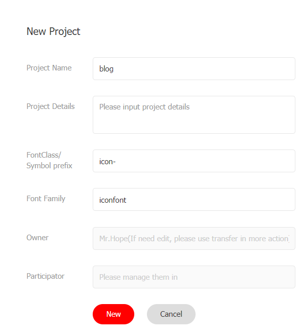
First, you need to create a new project to set and manage your website's icons:
- Log in to Iconfont.
- Find "Resources → My Projects" at the top of the website, and click the "New Project" icon in the upper right corner.
- Set a recognizable project name
- Fill in
FontClass/Symbol prefixwithicon-. You can also fill in according to your preference, but you need to manually set this value toprefixoption with an extra"iconfont"class in the front, e.g.:iconfont icon-
Import Icon
Search and find the icon you want to use, and click the "Add to Library" button on the icon

When you complete searching, click the "Add to Library" icon in the upper right corner, click "Add to Project" below, select the project you created then confirm.
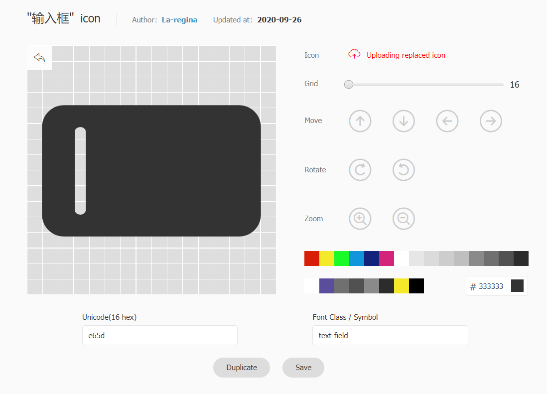
Edit Icon
On the project page, you can edit the icons in the project, including adjustments with position, size, rotate, color, Unicode number and Font Class / Symbol.
Generate Links
Click the "Font Class" button above the project and click Generate.

Then set assets option with the generated link.
Tips
You need to regenerate and update the link every time you add a new icon.
Images
Images links are supported with any icon types (relative links are NOT supported).
<!-- A full link -->

::https://example.com/icon.png::

<!-- icon.png should be placed in .vuepress/public folder -->

<VPIcon icon="/icon.png" /> <!-- ::/icon.png:: is NOT supported as it will be parsed as color -->
Options
assets
Type:
IconAssetexport type BuiltInIcon = 'fontawesome-with-brands' | 'fontawesome' | 'iconify' export type IconLink = `//${string}` | `/${string}` | `http://${string}` | `https://${string}` export type IconAsset = (BuiltInIcon | IconLink)[] | BuiltInIcon | IconLinkDefault:
"iconify"Details:
Icon assets to be used.
The following keywords are supported and you may use other CDN links or even your own:
iconify: Iconifyfontawesome: Font Awesome free icons onlyfontawesome-with-brands: Font Awesome free icons and brand icons
type
Type:
IconTypeexport type IconType = 'fontawesome' | 'iconfont' | 'iconify' | 'unknown'Default: Inferred from
assetsDetails:
Type of the icon, the plugin will try to infer the type from the assets, and fallbacks to
unknown.Notably, the plugin can recognize:
- iconfont css links
- fontawesome kits
- CDN links for fontawesome and iconify
prefix
Type:
stringDefault: Inferred from
assetsandtypeDetails:
Prefix for the icon component. By default, the plugin will use:
iconfont icon-for iconfont type- empty string for all other types
component
- Type:
string - Default:
"VPIcon" - Details: Name of the icon component
markdown
- Type:
boolean - Default:
true - Details: Whether to enable icon syntax (
::icon::) in markdown
offline
Type:
boolean | "all"Default:
falseDetails:
Bundle the icons locally instead of loading them from a CDN or the Iconify API, so the site works without internet access.
The icons are bundled for the icon type of the site, so this option does not affect the
typeandassetsoptions. See Offline Usage for Iconify and Offline Usage for Font Awesome for the packages to install.Only the
fontawesomeand theiconifyicons can be bundled, the build stops when the icon type is another one, e.g.iconfont.true: bundle the icons used by the site, which are detected from the page content, the front matter and the component props, see the scan option."all": bundle every icon of the icon type. It is only supported byfontawesome, as an Iconify icon set may contain thousands of icons, and the icons used by the site are bundled instead foriconify.
export default {
  plugins: [
    iconPlugin({
      prefix: 'mdi:',
      offline: true,
    }),
  ],
}
Icons are detected when the site is prepared, so adding an icon requires restarting the dev server.
Tips
Bundling every Font Awesome icon adds about 1.8 MB to the client bundle, while an Iconify bundle only contains the icons in use.
scan
Type:
IconScanDetails:
Fields to scan for the icons, which is used by the offline option and has no effect when the offline mode is not enabled.
export interface IconScan { frontmatter?: string[] components?: string[] scanner?: (app: App) => string[] | Promise<string[]> }frontmatterandcomponentsare field paths, which support the field access and the array index, where[*]matches every element of an array. A field that does not exist is skipped silently.
frontmatter
- Type:
string[] - Default:
['icon'] - Details: Front matter fields of the pages, e.g.
['icon', 'features[*].name']. Set it to[]to disable the front matter scan.
components
Type:
string[]Details: Props of the components used in the pages, in the form
<component>.<prop>, e.g.['VPCustom.icon', 'VPTest.files[*]'].The props of a component are read as one object, so
VPCustom.iconreads theiconprop, whileVPTest.files[*]reads every element of thefilesprop. A prop that is bound with:proporv-bindis reported when its value cannot be parsed as JSON, as its icons cannot be bundled then.
scanner
Type:
(app: App) => string[] | Promise<string[]>Details: Extra scanner for the icons that cannot be detected, e.g. the icons used by the theme config.
The returned icons use the same syntax as in markdown, e.g.
mdi:homefor Iconify andsolid:housefor Font Awesome.export default { plugins: [ iconPlugin({ offline: true, scan: { frontmatter: ['icon', 'features[*].name'], components: ['VPCustom.icon'], scanner: (app) => ['mdi:home'], }, }), ], }Tips
The reusable helpers are exported, so a scanner can build on them:
import {
  extractIconsFromComponents,
  extractIconsFromFields,
  parseComponentField,
} from '@vuepress/plugin-icon'

// read the icons of an object, e.g. a theme config or a data file
extractIconsFromFields(data, ['icon', 'features[*].name'])

// read the icons of the component props of the site
extractIconsFromComponents(
  app,
  ['VPCustom.icon'].map(parseComponentField).filter((field) => field != null),
)
Component Props
icon
- Type:
string - Required: Yes
- Details: Icon name
color
- Type:
string - Default:
"inherit" - Details: Color used for icon.
size
- Type:
number | string - Default: Current font size
- Details: Icon size.
verticalAlign
- Type:
string - Default:
"-0.125em" - Details: Vertical alignment of the icon.
sizing
Type:
"height" | "both"Default:
"height"Details:
How the icon is constrained:
height: Constrain the height only, the width follows the icon ratio.both: Constrain the width and the height, the icon is scaled proportionally to fill the box without distortion.
FontAwesome renders every icon on a
1.25em × 1emcanvas (20px × 16pxwith the default16pxfont size) and centers the glyph inside it, so wide icons are never squeezed. That is exactly whatsizing="both"does, which keeps FontAwesome icons aligned in lists, sidebars and toolbars.Other icon types use a square
1em × 1emcanvas.